TasteBuds
Encouraging college students to cook more meals at home - through a social approach
UX Case Study


Made with

Introduction
TasteBuds is an app where people can share their cooking with friends. They can post pictures of the meals they cook at home and gain an appreciation for what others have made as well. While anyone can enjoy using this app, it is primarily targeted at motivating young adults to be more comfortable with cooking.
Problem discovery
Throughout the past year as a college student, I've noticed that we often choose the convenient path of eating out, rather than at home. When we do cook, there is a common trend of friends and peers sharing the food they’ve made on social media. This wouldn’t be restricted to a single app, and “food pics” would scour through the various photo-sharing apps such as Facebook, Instagram, and Snapchat.
Solution
Create a designated platform for college students to share their home-cooked meals with friends. This not only provides the appeal of routinely sharing photos with each other but also promotes more meals at home, helping students save money and learn how to live more independently.
Initial Research

According to the Hartman Group, 53% of Gen Z enjoy cooking and 71% of them would love to learn how to cook more.
So, how can we encourage them to do so?
Goal: Use social media as a tool that can incentivize college students to cook more at home, through a designated platform.
In order to affectively achieve the end goal, I first had to gain a better understanding of my target audience and hear from the users myself. So I conducted a survey on 52 students in my school.


Insights

Many young adults use social media as a means of staying motivated, by having the incentive of receiving praise and appreciation from friends.
Why not have a designated platform rewarding them for cooking at home?
Gauging what's already out there, I chose three similar apps and thoroughly tested out each one. Through the initial onboarding, creating an account, navigating each page, and making a post, I noted key features to help determine how I could make improvements in my own platform.


Pepper- Social Cooking
4.9
out of 5
Effective color/style
Required to add recipe in order to post
Laggy/busy UI
Lack of scrollable feed page
Manna Cooking

4.9
out of 5
Effective color / style
Dating app-style swiping felt awkward
Cluttered Discover page

Unattractive UI
Foodnest
n/a
Simplest out of the three
Unorganized profile and discover page
The excessive amount of features was overwhelming and takes away from the motivation to post. This helped me establish the design direction to go for a simple user interaction experience, establishing a "path of least resistance".
User personas
Central target audience

Josh, 20
-
College student developing cooking skills, eager to try new dishes
-
Finds it difficult to stay motivated to cook, typically ends up eating out for the sake of convenience
-
When he cooks, he often shows friends what he made
Pain Points
-
Increased spending on eating out
-
Less control over diet
Needs & Goals
-
Improve cooking skills
-
Eat out less
-
Stay motivated to cook more
Edge case that can also be benefitted

Nora, 28
-
Employed, cooking enthusiast who enjoys posting her food to show friends
-
Instagram is primary platform she uses to post, but feels hesitant to post frequently due to pressure of followers
-
Wonders if there is a more close-knit platform for her and friends to regularly share what they made, separate from other aspects of social media
Pain Points
-
Pressure from followers preventing her to post
-
Distracted by other, non-food related posts
Needs & Goals
-
Be able to show off cooking regularly/casually without the worry of being seen as "spam posting"
-
Wants to see what her friends make regularly
-
Stay motivated to cook diverse dishes
User flow
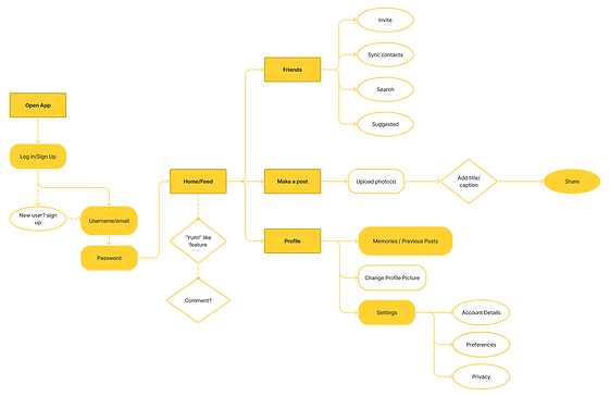
While mapping out the user flow, I kept the central idea in mind: go for simple. With the goal to promote cooking as a routine activity, I avoided any possibility of making the user feel any sense of burden when trying to post.

Now, with a theme in mind and having mapped out the structure of the app, I moved on to designing.


Once I had a general idea of the app navigation, I quickly sketched out some of the main pages.
I moved on to digitalizing the sketches, highlighting more accurate formatting and button/text hierarchy.


Here are 3 impactful changes I made to improve the design during the process:


Visual inbalance; too much weight at the bottom
Design improvement, but do we need but two separate navigation paths?
...Nope.
3-in-1 login screen
Single-function screens

Landscape to portrait image format
Less clutter, thumb placement

Early iteration
Experimenting with floating cards
Removed cards/shadows, more clarity
Final Screens


Color & Typography
🍳
Inspired by my breakfast, I went for a simplistic color palette that highlights the primary color, while maintaining a high contrast ratio and following the 60-30-10 rule.
#FFC700
Semi Bold
#1F1F1F
Medium
Bold
Inter
Regular
#FAFAFA
Prototype
I made a quick prototype that takes the user on a journey from logging in, to making a post. Click here to view the prototype.

Takeaways from this project
This was my first dive into UX research and design, and it's safe to say that I learned a lot.
Looking back, I would've liked to engage more with participants, conducting usability testing to help me see what works and what doesn't. Along with this, journey mapping and affinity mapping would've allowed me to also gain stronger insights on my target user.
Having embarked on this project from my own interest, there was a considerable amount of time spent simply learning about the various methods used to conduct a study. Through immersing myself in this field, however, I was able to gain a solid understanding of the user-centered design process which also helped me realize my passion to empathize. I enjoyed the big-picture idea of defining a problem/end goal, identifying the target user, and using design as a tool to craft a solution.
Looking ahead, I plan to continue improving my skillset towards eventually creating stronger design solutions that adhere closely to the user. This project has served as a great introduction for me to learn from, and I'm excited to keep growing...
...But why stop here?
What if I pushed this project a bit further? Now that I've created a design solution, what if I learned how to actually develop it?
Curious, I reached out to my friend studying CS. After a quick conversation, we went straight to work.
During the remaining weeks of summer, I collaborated with a friend to code this app; I focused on the frontend, while she worked on the backend. Here are some new things I learned from it:
-
Google's Flutter SDK, using Dart programming language
-
How to push and pull from a Github repository
-
I enjoy a balance of creative/technical work
-
I work better in a collaborative environment
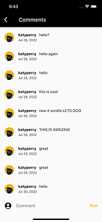
Screenshots (in development)
🚧


